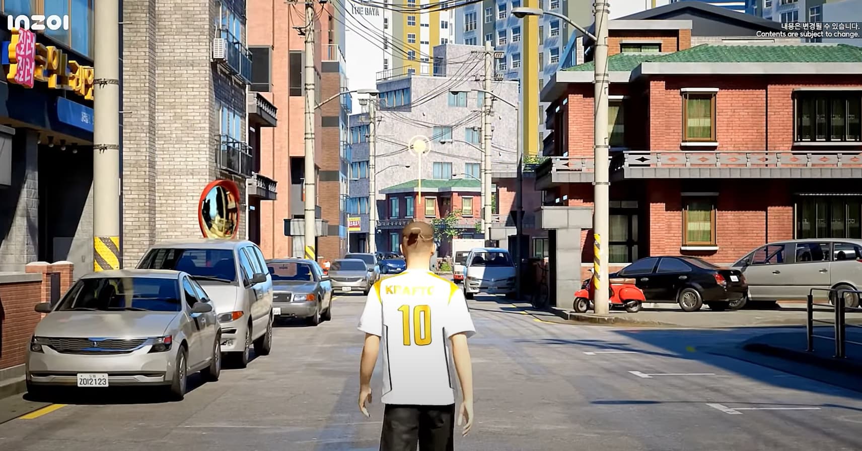
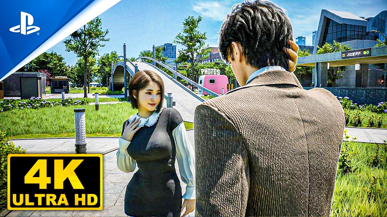
It feels overly yellowish and the colors seem too monotonous. The visuals used to feel vibrant before.
I didn’t really like the dowon cuz it feels too gloomy. But looking back at the demo footage, it actually looked beautiful back then. I get that the graphics were downgraded for optimization, but the color palette now just feels way too dull.
1 Like
Absolutely agree. Looking back, the game actually felt far more “next-gen” considering the industry-wide trend of tweaking color grading and pushing cooler, blue-toned shadows to match modern high-contrast and high dynamic range panels (say this as a Level Artist).
It’s no secret that inZOI uses the widely adopted 3rd-party Ultra Dynamic Sky plugin from Unreal Marketplace for lighting and sky atmosphere, which can sometimes lean a bit too yellow, since evening sun/sky temperatures can drop to 3400K, while daytime sun sits closer to 6200–7500K and sky temperatures can reach up to 15000K.
Meanwhile Unreal Engine has a Post Process Volume that allows precise control over brightness, contrast, and hue globally or separately for highlights, midtones, and shadows. Exposing those presets and allowing custom slots in the settings would be a fantastic move.
And of course, full respect to the art direction of early inZOI – graphics, HUD, fonts… Absolutely stunning! 


